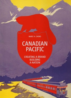
Canadian Pacific: Creating a Brand, Building a Nation, by Marc H. Choko. Berlin: Callisto, 2015. 384 pp. $80.
Despite the commercial and political emphases of its subtitle, this is more a nostalgic art book than a nostalgic history text or elaborate advertisement. It comes to market thanks to Matthias Hühne, the evidently wealthy patron-publisher of a press he has founded to preserve and celebrate some of the best of twentieth-century commercial art, especially that produced by the airline industry. So far he has published no more than one book – lavishly produced – a year. Last year it was the spectacular Airline Visual Identity, 1945-1975, which he wrote and edited himself. This year it is Marc Choko’s Canadian Pacific, again with superb colour reproduction values which appear to have cost more than the cover price suggests. Next year it will be the visual self-representations of Pan American Airline, in his own Pan AM: History, Design & Identity. Does the art work commissioned by an airline deserve to be reproduced as faithfully as the Book of Kells or the Duc de Berri's Tres Riches Heures? In these books it is.
The history of the CPR and its hotel, shipping, airline and other enterprises, from the railway’s beginnings in the 1880s to the 1980 end point chosen by Choko and Hühne for this volume, coincides with the flourishing of colour printing in advertising and magazine production – a period that symbolically ends with Kodak’s bankruptcy in 2012 and the rapid 1969-2004 expansion of the internet. CP’s locomotives, steamships, aircraft and the printing presses of its posters and magazine ads were all part of that Benjaminian age of mechanical reproduction
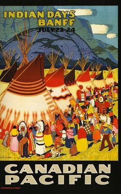 Poster by Wilfred Langdon Kihn, 1926. Choko 177.
 which digital technology brought to a close and on which this book casts a wistful eye, both in its imagery and in the decidedly retro means of its own reproduction. So dense is the paper and its various coatings that this 9" x 12" volume weighs almost 4.5 pounds. That age in North America was also a period of enormous wealth generation by government-assisted investors who converted aboriginal lands not only into 'nation' and commercial art but also into natural resources, real estate, scenery, 'extraction' industries, and tourism, accelerating among other things the climate change crisis which surrounds us today. The beauty of the commercial art preserved in this book is a beauty that had costs.
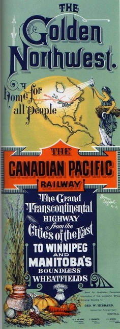
Only 42 of Canadian Pacific's 384 pages are text; 14 are maps, documentation, and other end matter. Nearly all of the remainder present images, mostly in colour and often full-page. So the book’s discursive rendering of “creating a brand” and “building a nation” is pretty brief and standard. The 1882 completion of a Canadian transcontinental railway forestalls the absorption of British Columbia and the Hudson Bay lands by the U.S. The railway opens those lands to settlement. It facilitates the movement of Canadian troops to quell the 1885 North-West Rebellion. The granting of extensive amounts of land to the railway, land which to its tracks add value and which it then resells, enables the rapid development of cities such as Vancouver and Regina. Creating a brand involves creating new commercial platforms on which to display that brand – hotels, land-sale offices, inland steamships, ocean liners, aircraft – and the rapid change from “Canadian Pacific Railway” to “Canadian Pacific” and toward the logo “CP.” It involves diversifying and modifying its activities as the world economy is roiled by technological change, world wars, and a global depression. These cursory narratives are offered by Choko mainly to give context to the images, which are what both author and editor are most interested in. The legends of how the railway in its first 20 years paid First Nations people to camp in their teepees beside the track, so that passengers could see them, is not here, nor of other massive disruptions the railway helped bring to indigenous culture. But the visual evidence of those is here in the feather-decked faces that smile out from some of the advertising.
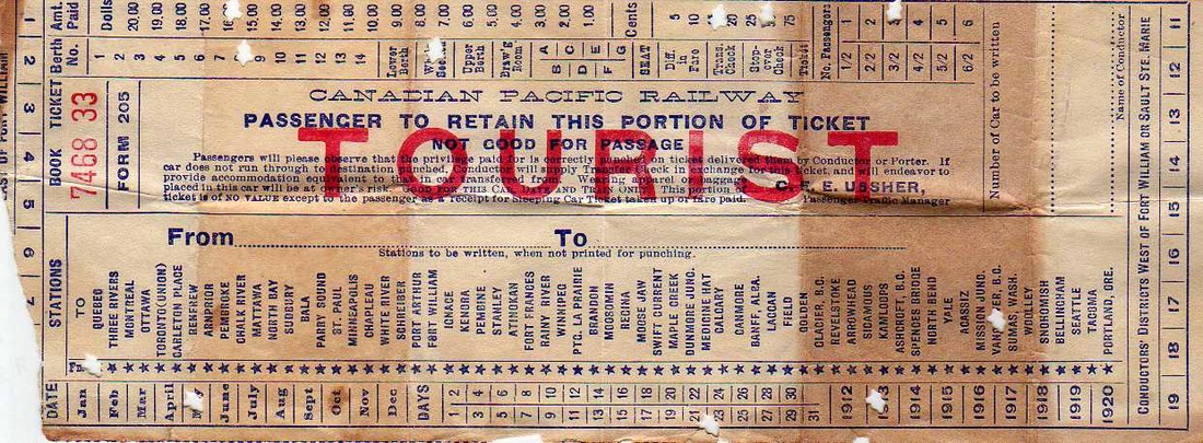
Certainly the CPR played a huge role – too huge, one might think – in shaping the lives of Canada's inhabitants. My own family is an example. My late wife’s grandfather prospered in the 1880s and 90s designing and building houses, a hospital, a school and shops on land in Vancouver that was gaining value by CP’s decision to move its western terminus from Port Moody to Vancouver. In 1893 he was able to take his family to the Chicago World’s Fair, over Canadian Pacific Railway tracks. My paternal grandparents were lured in 1904 to go by rail from Ontario to Vancouver where my grandfather found work with the British Columbia Electric Railway Company – a company that was in 1904-5 just starting out by electrifying a rail line from Vancouver to Steveston originally built by the CPR. My maternal grandparents came immigrant class from Britain in 1913 on CP’s Empress of Ireland and travelled to Vancouver from Quebec City on its railway. They preserved their CPR ticket for the rest of their lives – "passenger to retain this portion of ticket" indeed!
Only 42 of Canadian Pacific's 384 pages are text; 14 are maps, documentation, and other end matter. Nearly all of the remainder present images, mostly in colour and often full-page. So the book’s discursive rendering of “creating a brand” and “building a nation” is pretty brief and standard. The 1882 completion of a Canadian transcontinental railway forestalls the absorption of British Columbia and the Hudson Bay lands by the U.S. The railway opens those lands to settlement. It facilitates the movement of Canadian troops to quell the 1885 North-West Rebellion. The granting of extensive amounts of land to the railway, land which to its tracks add value and which it then resells, enables the rapid development of cities such as Vancouver and Regina. Creating a brand involves creating new commercial platforms on which to display that brand – hotels, land-sale offices, inland steamships, ocean liners, aircraft – and the rapid change from “Canadian Pacific Railway” to “Canadian Pacific” and toward the logo “CP.” It involves diversifying and modifying its activities as the world economy is roiled by technological change, world wars, and a global depression. These cursory narratives are offered by Choko mainly to give context to the images, which are what both author and editor are most interested in. The legends of how the railway in its first 20 years paid First Nations people to camp in their teepees beside the track, so that passengers could see them, is not here, nor of other massive disruptions the railway helped bring to indigenous culture. But the visual evidence of those is here in the feather-decked faces that smile out from some of the advertising.
Certainly the CPR played a huge role – too huge, one might think – in shaping the lives of Canada's inhabitants. My own family is an example. My late wife’s grandfather prospered in the 1880s and 90s designing and building houses, a hospital, a school and shops on land in Vancouver that was gaining value by CP’s decision to move its western terminus from Port Moody to Vancouver. In 1893 he was able to take his family to the Chicago World’s Fair, over Canadian Pacific Railway tracks. My paternal grandparents were lured in 1904 to go by rail from Ontario to Vancouver where my grandfather found work with the British Columbia Electric Railway Company – a company that was in 1904-5 just starting out by electrifying a rail line from Vancouver to Steveston originally built by the CPR. My maternal grandparents came immigrant class from Britain in 1913 on CP’s Empress of Ireland and travelled to Vancouver from Quebec City on its railway. They preserved their CPR ticket for the rest of their lives – "passenger to retain this portion of ticket" indeed!
My father found work in 1925, when he was 15, as a messenger boy on CP’s Empress of Asia, sailing between Vancouver, Yokahama, Nagasaki, and Hong Kong. I spent my childhood in Abbotsford, a B.C. village named after Henry Abbott, western manager of the CPR, who around 1900 had constructed a branch line from Mission City on the main line, south across the Fraser River to the Northern Pacific Railway (since 1970 part of Burlington Northern) in Washington State – giving the village a reason to come into being at the spot where the new line intersected with the Old Yale Road that had run from New Westminster to the Cariboo since the 1859 gold rush. In my teens my family would holiday in national parks that had come into being to help commercialize the CPR route through the Rockies – Yoho, Banff, and Lake Louise. The highway from Vancouver to them was at that time, from Revelstoke onward, a gravel road that followed a 200 mile “big bend” in the Columbia River – much longer and more primitive than CP’s route through impressive tunnels and scenic mountain passes.
 Poster by Clement Dane Studio, 1932. Choko 81. | 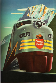 Poster by Peter Ewart, 1952. Choko 285. | 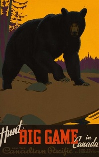 Poster by Thomas Hall, 1938. Choko 227. |
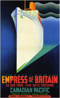
That dominance of CP in early twentieth-century Canada will give this book’s images special meaning to readers who have some connection to that period. One thing many may note is the enormous size CP awards itself in many of them. Its ships are photographed from the waterline upward so that they tower over the viewer, locomotives are similarly photographed from railbed level. They promise to deliver the dwarfed but happy passenger to places where nature is similarly oversize, and similarly imposing. Moose, bear, mountains can tower over the locomotives that previously towered over prospective passengers. The similarity in composition between the images of ships and the images of nature suggests that the company is identifying its properties with the natural, as if it wants to be seen as similarly enduring and powerful. In the images of trout, bear and moose, which of course the railway is presenting as potential trophy-kills, the similarity offers a certain irony.
Choko’s comments on the art itself are brief but useful. He points out how belated the style of CP’s art tended to be until the 1930s when CP established in Montreal its own silkscreen studio, a process which favored the flat colours of Art Deco. He remarks that in whatever style, the art necessarily romanticized what it represented, sometimes not merely in smiling faces but in explicit promises, as in the 1884 steamship poster below that promised "perfect safety." Despite the technical accomplishment of the mostly British artists of 1880-1930, their work is largely Victorian and Art Nouveau in these early decades, and not often Impressionist until the 1920s. The work of the mostly Canadian artists of the silkscreen studio remains Art Deco into the 1940s and 50s.
 Anonymous poster, c. 1883. Choko 101. | 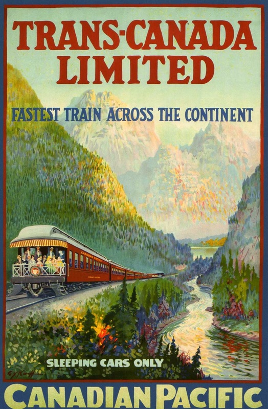 Poster by G.Y. Kauffman, 1924, which Choko notes resembles an impressionist painting. 54-55. | 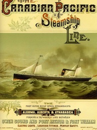 Anonymous poster, c. 1884. Choko 41. 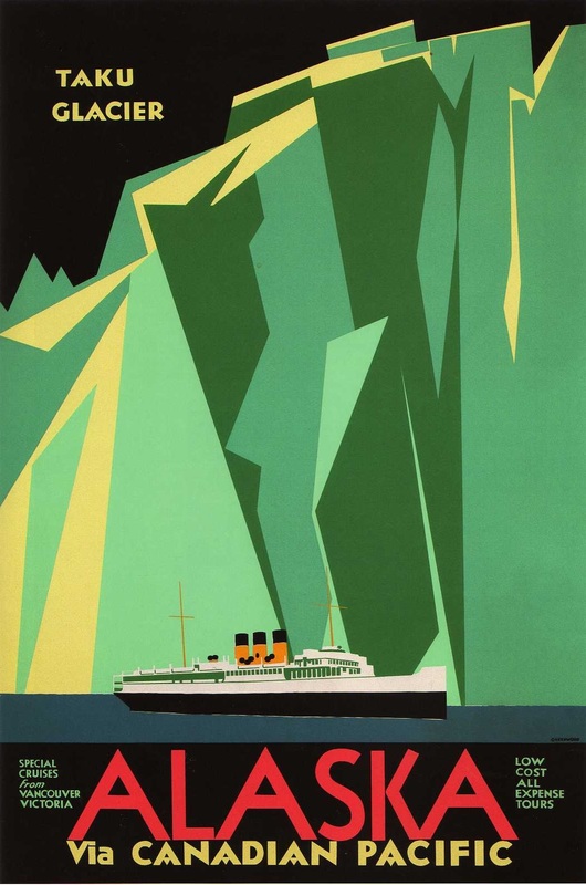 Poster by Charles James Greenwood, 1935. Some obvious resemblance here to the early 1930s arctic paintings of Lawren Harris. |
This trajectory is hardly surprising, however, since it follows the art tastes of its target audiences. However, most of the major images presented in this book are from the more interesting Art Deco periods. Moreover, by the 1950s there are hints in these of the pop art that is about to emerge – hints of the art of Rauschenberg, Warhol, Lichtenstein, Oldenburg, Canada’s Greg Curnoe and John Boyle, as those artists begin their mischievous adapting of commercial art and comic book art styles.
 Poster by Peter Ewart, 1955. Choko 303. |  Poster by Peter Ewart, 1940. Choko 243. | 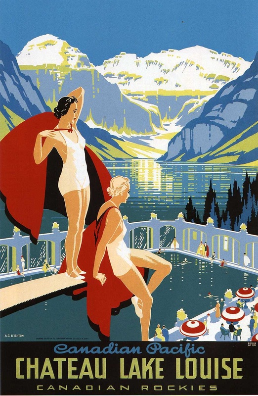 Poster by Alfred Crocker Leighton, c. 1937. Choko 191. |
This is an unlikely book well worth owning and meditating on. Hühne and Choko have done a quite a service in collecting, restoring (many posters had to be digitally healed of tears and crease marks), and re-circulating these images from the Canadian past – and letting them for the most part testify on their own.
FD
FD
 RSS Feed