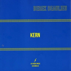
“Kern is made by hand using dry transfer lettering without the use of computers,” Derek Beaulieu begins his “Author’s Note” afterword to this impressive collection of visual poems. Most poems are made by hand, of course, even those made by hands on typewriter or computer keyboards. It’s not so much the hand, however, that Beaulieu seems concerned with here – disabled artists are known to draw with their feet or mouths, and hands are still used to turn on most smartphones and other computers – as it is the non-use of computers. Beaulieu follows the avant-garde tradition here of re-purposing commercial technologies that were abandoned before their full artistic potential could be explored. Usually artists have been attracted to commerce’s cast off technologies such as the letter press and the mimeograph because they’ve been inexpensive to acquire. That’s not necessarily the case here. In fact the production of Les Figues’ elegant 8" x 8" edition of Beaulieu’s poems appears unsurprisingly indebted to computers, right down the barcode.
The most widely known brand name of dry transfer lettering during the 1960s and 70s was Letraset, which bpNichol used in some of his early Ganglia books, and which I used on each page of the first four issues of Open Letter in 1965-1967. Beaulieu writes here that it was then “a specialized tool with an expensive price tag”; I don’t recall that. It was an inexpensive tool by contrast to typesetting, and could be easily combined with the other then developing technologies of offset printing, which I used, and xeroxing, which Nichol used, to make multiple
The ‘kern’ of Beaulieu’s title can be either a noun or a verb. As a noun it denotes the small parts of a piece of type that project beyond its body or ‘shank’ – the crossbar and bottom curl of a ‘t’ for instance, the ‘dot’ on an ‘i’. As a verb – likely the form that Beaulieu is using – it denotes the process of arranging and establishing the space between pieces of type. Most wordprocessing programs offer the user an option for changing the kerning of a word or line or paragraph. Beyond choosing the letters and fonts to include in these poems, kerning is what Beaulieu does here, and would probably be a more accurate title, I think, than ‘kern,’ with its noun/verb ambiguity. Though he could possibly intend the verb in its imperative mood – KERN!!! – the command that he has felt impelled to follow in this book 87 times.
Kern begins with relatively small works – its first poem is two columns of six lower-case ‘n’ surrounding two facing and attached columns of four attached upper-case ‘K’, all sans-serif. It concludes with poems that fill the page with a riot of fonts, letters, and point sizes. So one way to enjoy the book is to treat it as a child’s ‘flip’ book, and riff the pages from front to back, creating a ‘big bang’ as a universe of type is born and expands, ultimately filling all that is.
The book is conceptually indebted – deliberately I’m sure – to earlier visual poetry that worked with the alphabet – Nichol’s 1967 ABC, Ian Hamilton Finlay’s 1976 The Boy’s Alphabet Book, Steve McCaffery’s 1973 Carnival (which the last poems here strongly resemble). McCaffery too had to ‘kern’ the spaces between the blocks and strands of his typewriter lettering. Beaulieu, however, makes no use of alphabetic sequence, opening with a poem made of an ‘n’ and a ‘K’, following with one made of two ‘r’ superimposed on two ‘i’ (a poem which deftly illuminates the shanks and kerns of the two letter-forms) and following those with one that deploys an ‘L’ and (two) ‘A.’
In that afterword Beaulieu reveals what these and the other sometimes seemingly cryptic poems ‘mean’ – SPOILER ALERT: Kern readers should be careful not to mar their fun by reading the afterword first, or by reading any more of this review. But the afterword is a useful and innovative move – so much speculation would have been avoided had Joyce or Michaelangelo attached similar notes to their major works. Beaulieu reveals to the reader that the poems emulate “the logos of corporate sponsors,” that they are “the logos and slogans for ’pataphysically impossible businesses.” (I’m not sure I understand the last part here – shouldn’t that be “even ’pataphysically impossible businesses”?) He continues:
“... Kern uses the particles of language to represent and promote goods and corporations just out of reach. Kern presents moments of poetic nostalgia for the signposts of a non-existent past; they fitfully recall an etherial, ephemeral moment. [....]These poems are the street signs, the signage, the advertising logos for the shops and corporations that are just beyond reach.”
Indeed, the fifth poem with its connected ‘g’ and inverted ‘g’ with periods inserted into the top circles does suggest a panoptic Google trademark, and the twentieth poem with its bold-face ‘H’ surrounded by two ‘I’ suggests a very friendly (‘HI there!’) International Harvester. After reading the book AND Beaulieu’s afterword, a reader can locate all sorts of similar not quite decypherable messages. The two blurb writers for the book, Marjorie Perloff and Johanna Drucker, appear to have been assisted by the “Author’s Note” when they describe the book’s connection to “the signs, logos & slogans of everyday life” (Perloff) and to “the signs of masons, brands, trademarks, monograms & graphical poetics” (Drucker).
I like Kern. It makes me nostalgic for Letraset, rubber stamp art, the grainy images of early Xerox, and for dear bp. I can read it, thanks to the afterword, without fear of being baffled by its exuberant precisions. I wonder whether Naomi Klein will read it. It is so much richer than reading the advertising of Google and International Harvester.
FD
 RSS Feed